
Planet Partnership
Brand Identity Concept Development - PepsiCo x Beyond Meat
Client: PepsiCo, Beyond Meat
Creative Director: Zach Abell
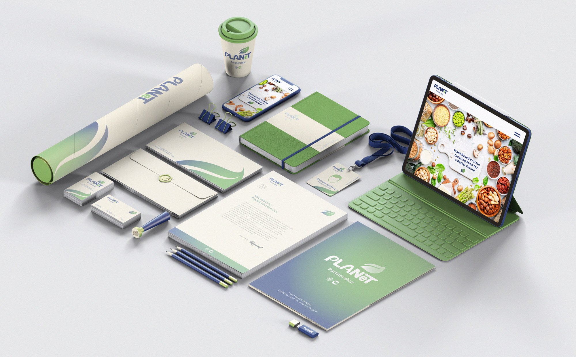
Whilst working with PepsiCo I was offered the chance to develop brand identity for the PepsiCo x Beyond Meats plant based food partnership the ‘PLANeT Partnership’. The project was tendered out to all creatives in the PepsiCo world. This design went to final stages, in the end they went with a different design.
The design was built around the key brand colours of both companies - blue of PepsiCo and green of Beyond Meat. The worked nicely in developing the leaf/globe icon, as the blue reflects the ocean and atmosphere of earth and the green the land and vegetation (plants) - with the focus being on the plants. The icon was made up of a leaf and sphere. The leaf was 3d wrapped a sphere and shaded, so a leaf and planet could both be visible. As the ‘Plant’ part of the company logo was to be the main focus green dominates the icon.
The partnership itself is corporate, so the logotype was built to balance corporate with the organic/ plant based mission. The hard edges, curves and leaf references was how I tried to communicate this. The corporate blue of PepsiCo was used more dominantly here too. The little lowercase ‘e’ in green was done to put more emphasis on PLANT than Planet, yet still have it read clearly as Planet.

Logo Design Guides
LOGO development
Colour Management

Icon Build Process


Original Font

Customised Font
